Configuration Options in Full-Screen Mode
A Single value visualization is a single numeric value displaying some key information. This view is particularly helpful when you want to emphasize key data points like maximum sales, total open issues, average resolution time, etc, at a glance.
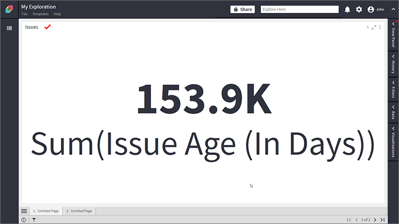
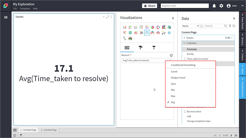
In the example given below, a Single Value visualization is created to analyze the time spent on Jira issues.
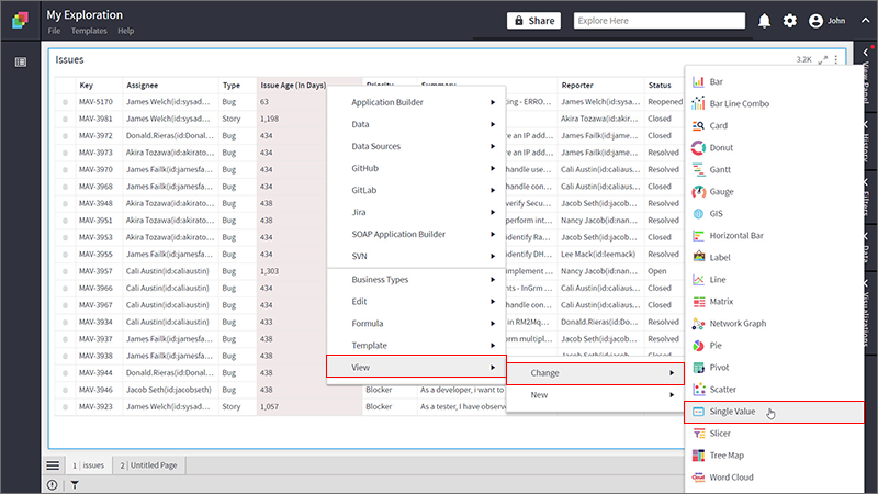
To create a Single Value visualization:
Right-click on the Assignee column > Select View> Change> Single Value.
Refer here to learn more about creating a visualization.
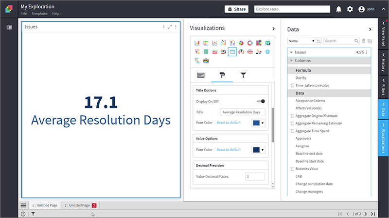
The following figure shows the resulting Single Value visualization.
Configure Single Value
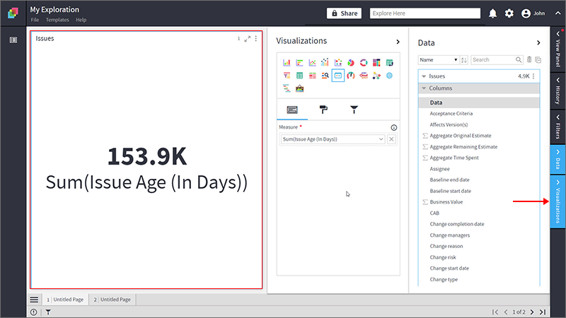
- Select your Single Value visualization and open the Visualizations Panel.
The following configuration options are available for Single Value visualization:
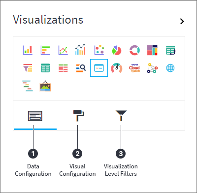
- Data Configuration
 : It lets you choose a column for your Single Value visualization:
- Visual Configuration
 : It lets you configure the appearances and interactions of the visualization.
- Visualization Level Filters
 : They let you filter the data in the visualization without impacting the other visualizations on the same data set.
Refer here to learn more about Visualization Level Filters.
Data Configuration
- Click on the
 icon for data configuration options.
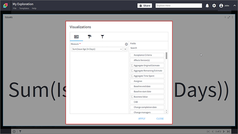
Measure
Measures are aggregated numerical data such as the sum of time spent, average cost, the total number of assignees etc.
Specify the column to be aggregated and shown as Single Value.
To change the ‘Measure’ column:
- Click on the
 to remove the existing column.
 - From the Data Panel, drag the desired column and drop it onto the Visualizations Panel’s “Measure” section.
- Click on the
 icon to select the aggregate function.
 Note: You can also type the column name in the Data Panel to quickly find it.
- Aggregate functions for textual data: Count, Unique Count
- Aggregate functions for numerical data: Count, Unique Count, Sum, Min, Max, Avg
The selected aggregate function will calculate the value to be displayed in the Single Value visualization.
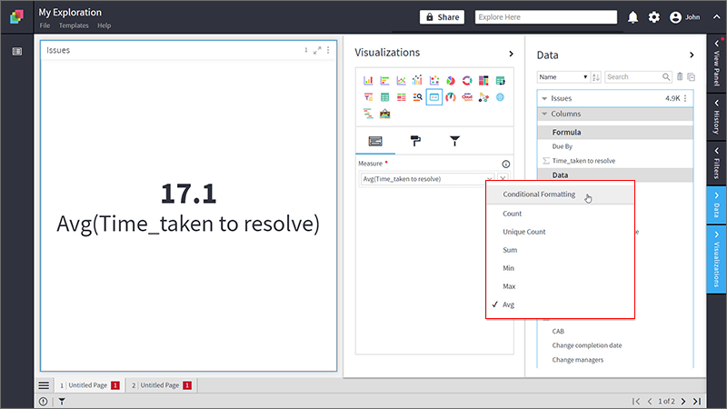
Conditional Formatting
This allows you to show an image with your data by applying certain conditions. Multiple conditions can be combined as well.
To apply conditional formatting:
- Click on the
 icon next to the column name and select ‘Conditional Formatting’.
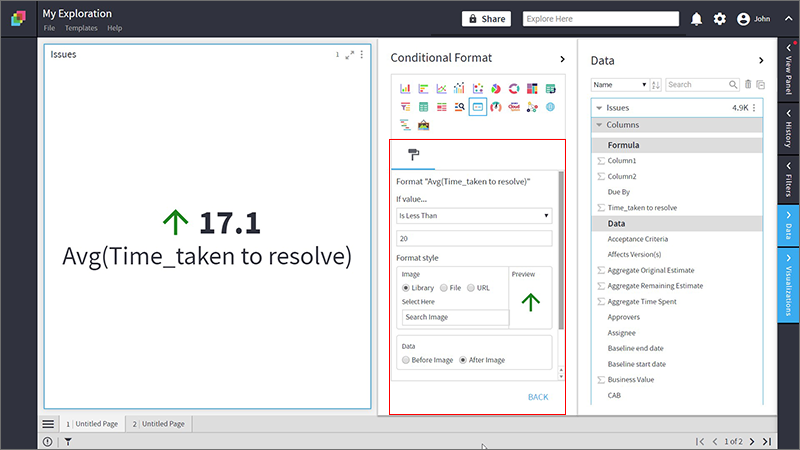
- Define the conditional formatting rule:
- Select the criteria from the drop-down.
- Provide a threshold value.
- Set the format style to choose an image to be shown when the above criterion is true. You can provide the image in the following ways:
- Select Library and click on Search Image to select an image pre-bundled with Klera.
- Select File and click on Upload File to choose one from your machine.
- Select URL and Type In the URL of an image.
- Select the radio button to show data before/after the image.
- Click on ‘Add’.
- Click on ‘Back’ to return to the list of columns for the Pivot chart. This
 icon indicates that conditional formatting is applied to the column.
To learn more about conditional formatting, refer to the following GIF.
| Note: Steps for conditional formatting are same for Grid and Single Value visualizations. |
Visual Configurations
- Click the
 icon for visual configuration settings.
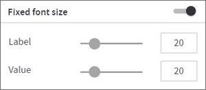
Fixed Font Size
When this is turned off, the font sizes for label and value will be adjusted according to the container size of the visualization. But with fixed font size, once you set the sizes for the label and value, they will remain fixed irrespective of any change in the container size.
To define the fixed font size:
- Turn on the Fixed Font Size toggle.
- Provide the font sizes for label and value.
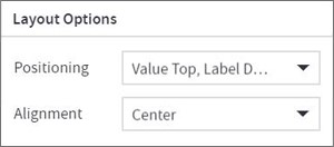
Layout Options
- Positioning: Set the positions for label and value. Choose from the drop-down:
- Label Top, Value Down
- Value Top, Label Down
- Alignment: Set the alignment of the value. Choose from the drop-down:
- Center
- Left
- Right
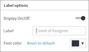
Label Options
You can hide or show the label. By default, the label is shown.
- Display On/Off: Toggle switch to hide or show the label.
- Label: Provide a custom label if you want to change the default label.
- Font color: To change the font color, click on the
 icon and select a color.
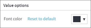
Value Options
- Font color: Click on the icon and select a color.
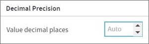
Decimal Precision
- Choose the number of decimal places you want to display your value with.
Container Settings
- To show or hide the header and border, click the toggle switch.
- Turn on the toggle switch to show the border for the container. Change the border color, style and width as shown below:
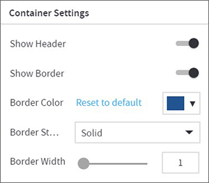
The following figure displays the effect of various container settings for your Single Value visualization.
Visual Interactions
- Select the target behavior and coordinated visualization scope from the below settings.
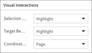
To learn more, refer to section- ‘Configure Coordinated Visualization’.
Configuration Options in Full-Screen Mode
Visualization can be seen in full-screen mode by clicking on  icon.
icon.
| Note: Visualizations Panel is not accessible in full-screen mode. |
- Click on
 icon at the top-right corner of the container.
 - Select ‘Configure View’ from the overflow menu.
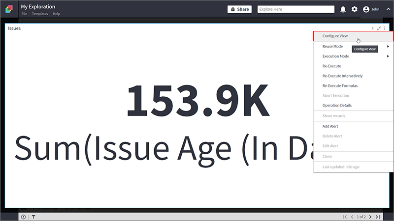
- A pop-up form with all the relevant configuration options will appear.
- Configure your visualization and click on ‘APPLY’.