Configuration Options in Full-Screen Mode
Grid visualization is the most basic visualization for displaying data in Klera. It is a simple arrangement of rows and columns.
Configure Grid Visualization
- Select your Grid visualization and open the Visualizations Panel.

The following configuration options are available for your Grid:
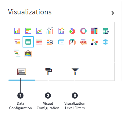
- Data Configuration
 : It lets you manage columns in your Grid:
a. Columns
i. Conditional Formatting
b. Sorting - Visual Configuration
 : It lets you configure the visual appearances and interactions of the Grid.
a. Column Configuration
b. Container Settings
c. Visual Interactions - Visualization Level Filters
 : They let you filter the data in the Grid without impacting other visualizations on the same dataset.
Refer here to learn more about Visualization Level Filters.
Data Configuration
- Click on the
 icon for data configuration options.
Columns
You will see the columns in the Grid as per their order in the list of columns in the Visualizations Panel.
You can perform the following operations on columns.
Add Column
- Drag the desired column from the Data Panel and drop it onto Visualizations Panel’s “Columns” section. Type the column name in the Data Panel to quickly find it.
|
|
Edit Column Name
- Click on the column name or the
 icon and type in the new column name.
Remove Column
- Click on the
 icon to remove a column from the Grid.
Reorder Columns
- Select the column and drag it to the desired position and drop it.

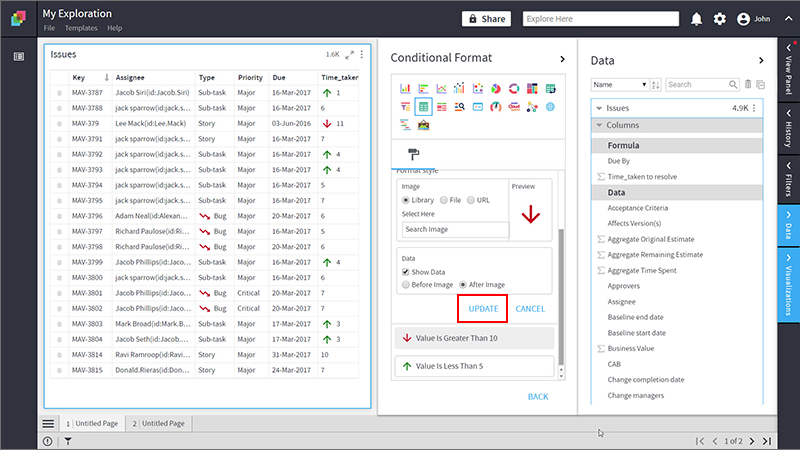
Conditional Formatting
This allows you to show an image with your data by applying certain conditions. Multiple conditions can be combined as well.
To apply conditional formatting:
- Click on the
 icon next to the column and select ‘Conditional Formatting’.
 - Define the conditional formatting rule:
- Select the criteria from the drop-down.
- Provide a threshold value.
If any value in the column is greater than 10 then place an icon next to the value. By applying this rule, you'll be able to see the values that meet this condition. - Set the format style to choose an image to be shown when the above criterion is true.
You can provide the image in the following ways:
- Select Library and click on Search Image to select an image pre-bundled with Klera.
- Select File and click on Upload File to choose one from your machine.
- Select URL and Type In the URL of your image.
- Select Show Data checkbox to display data as well as the image.
- Select the radio button to show data before/after the image.
- Click on ‘Add’.
- Click on ‘Back’ to return to the list of columns for your Grid visualization. This
 icon indicates that the conditional formatting is applied to the column.

Update Conditional Formatting
To update the condition for a column:
- Click on the conditional formatting
 icon
icon - Change the criterion or format style.
- Click ‘UPDATE’.
Remove Conditional Formatting
To remove a condition:
- Click on the
 icon for the desired column. You will see the criteria listed at the bottom.
 - Click on the
 icon to remove the condition.
Sorting
Sorting allows you to change the order of data making it easier to find what you're looking for. You can do a multi-column sort on a Grid. For e.g. you can first sort on 'Assignee', and then on 'Priority'.
Add Sorting Levels
- In the ‘Sorting’ section, click on ' Add Level’. A sorting level will be created.
- Select the column to sort on from the drop-down.
 Note: You can only sort on the columns present in the Grid.
- Click on the ascending
 , descending
  icon to toggle the sorting order.
- Repeat these steps to do multi-column sorting.
Reorder Sorting Levels
The order of columns in the Sorting section defines the order of sorting in the Grid.
- Drag and drop columns in the sorting section to change the sort order.
Remove Sorting Levels
- Click on the
 icon to remove the sorting level.

Visual Configurations
- Click on the icon for visual configuration settings.
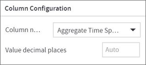
Column Configuration
- Select a numeric column from the drop-down, and choose the number of decimal places you want to display the values with.
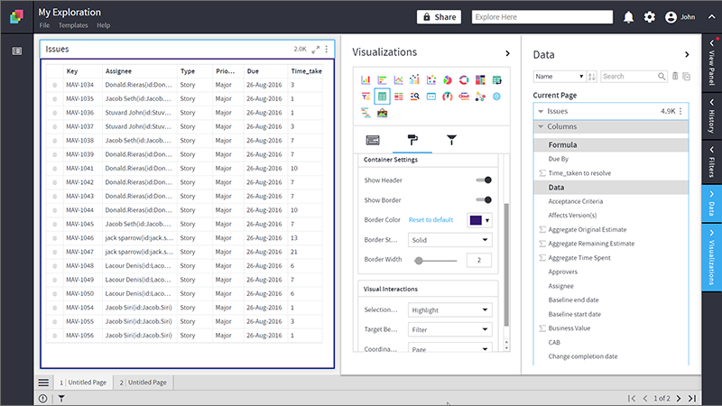
Container Settings
- To show/hide the header and border, click the toggle switch.
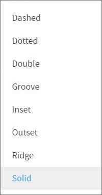
- Turn on the toggle switch to show the border for the container. Change the border color, style and width as shown below:

Border Styles
The following border styles are available:
The following figure shows the effect of various container settings.
Visual Interactions
- Select the target behavior and scope for the coordinated visualization from the settings given below:
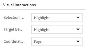
To learn more, refer to section- ‘Configure Coordinated Visualization’.
Configuration Options in Full-Screen Mode
Visualization can be seen in full-screen mode by clicking on  icon.
icon.
| Note: Visualizations Panel is not accessible in full-screen mode. |
- Click on
 icon at the top-right corner of the container.
 - Select ‘Configure View’ from the overflow menu.
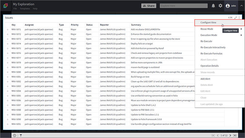
- A pop-up form with all the relevant configuration options will appear.
- Configure your visualization and click on ‘APPLY’.
